Comparing HoloLens Generation 2 to its predecessor
on my head, neck or eyes.
Earlier this year at Mobile World Congress, Microsoft announced HoloLens Generation 2. Since then, the industry, as well as the world, have been extremely intrigued with a hint of doubtfulness regarding this impressive piece of technology. Not many people have had the privilege to have a hands-on session with one of these devices so it has been very hard to verify or debunk what Microsoft has promised with the headset—until today. In today’s blog, we will be comparing HoloLens Gen 2 to Gen 1 and share our thoughts on the device.
Last week, we traveled to Microsoft’s Headquarters down in Redmond and took part in Mixed Reality Developer Days. This event was designed for developers to build their skills, learn about Microsoft’s mixed reality technology, network, and more importantly, get hands-on time with some of their latest MR technology, such as the Azure and the HoloLens Gen 2.
Report Summary
Comfort
HoloLens Generation 2 is definitely more comfortable than Gen 1. Hardware has been distributed evenly to create a near-perfect center of balance.
Spatial Sound & Voice Recognition
Not much changed other than another set of speakers for better understanding of environmental sounds vs voice commands.
Hand Tracking & Response Time
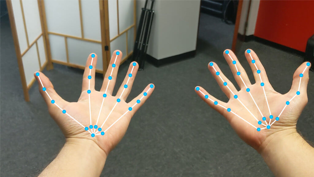
Incredibly responsive and real-time tracking was impressive. Full finger tracking, but the index finger is the only finger that is functional when it comes to clicking or pressing. However, the whole hand is needed to functions such as grabbing and rotating objects via wrist rotation.
Gestures & Holograms
Gestures are very instinctual, no real need for a tutorial when it comes to close interactions. Far interactions might require a quick tutorial. Holograms are still on development stage. Can’t speak much regarding them other than hoping all bugs get fixed in the next few months.
Comparing HoloLens – Full Report
Comfort
Gen 1 was an outstanding device for the time it came out, as there was nothing that compared to it. However, one of the few drawbacks it came with was weight and balance on one’s head.
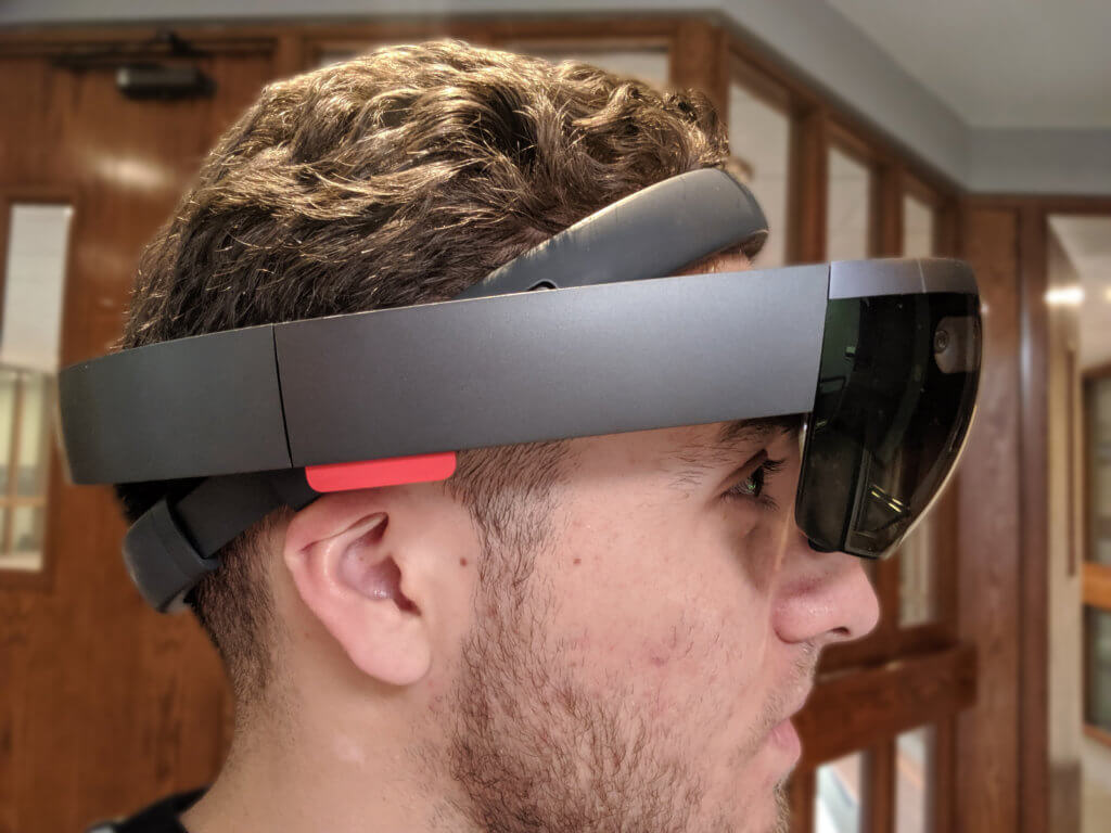
If you’ve never used HoloLens Gen 1, as you can see in the picture above, the device is very front-heavy, as it stores most of its components there. There was a constant weight pulling on your head and if you wore it for a few hours, you would definitely start to feel the strain on your neck.
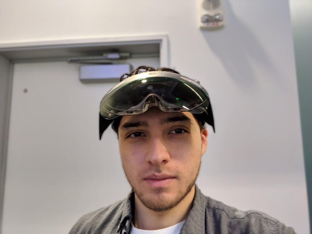
Enter Gen 2. Prior to picking it up and putting it on my head, the headset looks just as heavy, if not slightly heavier than Gen 1 because of its size and the fact that there is another component in the back side of the device. However, As Alex Kipman announced back in February, comparing HoloLens Gen 2 to Gen 1, it claims to have “triple the comfort” than Gen 1. To our surprise, even though it looks slightly bulkier, the weight is definitely lighter, and perhaps more importantly, the balance of the device is astounding. Rather than implementing and storing all the components in the front, Gen 2 is designed so that the front only houses the components that require to be at the front. Everything else is stored in the back unit as well as the arms on each side.
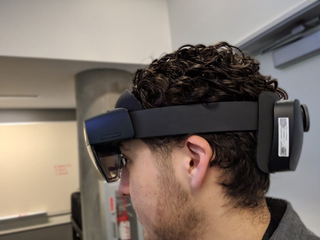
In order to design the headset, Microsoft scanned the heads of over 600 people from different ages, ethnicities, and gender to make sure that the headset would fit well on 95% of heads. The weight might have decreased by mere grams, but the main reason it feels so light is that the device’s center of balance is very much parallel with a human’s center of balance. This means that by wearing the headset, it very much feels like a proportional extension of one’s head, resulting in the wearer not being conscious of the fact that they are being weighted down by this device, allowing the device to feel lighter than it is.
Spatial Sound & Voice Recognition
We didn’t really notice much difference when comparing HoloLens Gen 2 and Gen 1 regarding Spatial Sound. The speakers are placed seemingly on the arms of the device and they rest just above your ears. We tried it in a crowded room, and although it was quite hard to catch every word being said in the holographic tutorial, it was still usable and not a problem if you need it for environmental immersion.
On the Voice Recognition front, there was a change made on Gen 2 that was incredibly impactful, especially for using the device in loud spaces. On top of having 3 speakers on the top of the visor, they also added 2 speakers under the visor—each located right below the holographic panel. The reason for this is so that the device is able to use the top speakers to hear and understand environmental noise, while the bottom 2 are for a clear understanding of one’s voice so you don’t have to scream your commands out. They are not smart enough to know if the wearer is the one talking, so if someone next to you says a command, chances are that it’ll register and activate the command, so it’s best to not make your commands something that will casually come up in conversation.
Hand Tracking & Response Time

This was the real ‘Wow’ moment for us. Ever since the announcement back in February, and every Demo since; the response time and the hand tracking have always been on the back of our minds. Is it really as fast and as responsive as the demos make it seem?
The quick answer is, Yes. Gen 2 displays a real-time skeletal mesh overtop your hand, stretching from your wrist to the tip of each finger. As for interacting with holograms, they made sure to track your hands as well as read depth between your hand and holograms. This allows us to not just air-tap on holograms, but to walk to them, pick them up as if we would real objects. The response time between gestures and holograms was incredible. We were able to drop a hologram in the air and catch it halfway before it hit the ground. Unfortunately, the only finger that is registered and is able to interact with the holograms is your index finger, even though the whole hand is tracked. So that leaves playing the piano out unless you are in the one finger playing stage. However, since the whole hand is tracked, we could always use that information and add collision to the rest of the fingers, at possible loose of accuracy and perhaps unwanted activations.
Another question answered was the rendering of the hand on the holograms. Comparing HoloLens Gen 1 and 2, they both lack this feature as they decided that unless this feature was bang on perfect, it would not be included in the new generation. With that being said, it doesn’t take away anything from the experience so for us it’s not a huge loss. If you really are keen on having your hands or something displaying on top of the holograms, there is always the option to keep the skeleton mesh displayed or creating real looking hands and having them display on top of your hands.
Gestures & Holograms
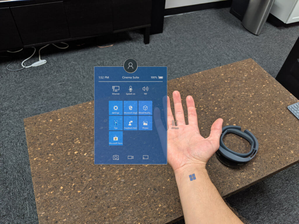
If you are familiar with Gen 1’s gesture system, you are going to have to forget what you know and start fresh with Gen 2. Gen 1 used a bloom gesture to go back to the main menu and an air-tap to select holograms. For Gen 2, bloom has been retired and in comes the wrist button. This was quite neat since you don’t see it at all unless you rotate your hand face up, and a small icon appears at the base of your wrist. You then press on that button with the other hand and the main menu comes up. This was very slick and a great way to use the functioning push/press gestures as it actually feels like you are pressing on your skin to bring up the menu.
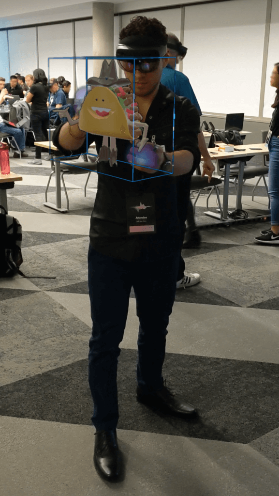
As for the air-tap, it’s not much of an air-tap but more of an air-grasp now. With depth perception being a factor now, you are able to walk up to the holograms and grab them, rotate them and throw them around as if they were real. Check out This article for an example. Near-interactions are very instinctual as they involve grabbing and rotating. Far-interactions however, use the same gesture system but instead of you getting close and grabbing the object, a ray cast cursor appears out of your wrist and snaps to the objects at far—very similar to Gen 1. With that cursor, you are able to use the same grab or rotate gestures as you would in the near-interaction. The only problem we came across with is the fact that by allowing us to have so much freedom with our hands, at times the camera can’t understand or see the hand positions very well, thus resulting in models jumping, activating or not reading proper commands. We found a number of people at the event had trouble with this as well as unwanted grabbing happening in objects close to their hands. This is great for comparing HoloLens Gen 1 and 2 as they both have their own unique gesture systems so we can construct pros and cons on both of them.
We can’t really compare the hologram quality just yet, as they reminded us that what we would see is not the final version since they are still developing. But with what we saw, it looks like they are really close to finalizing the gesture system, but they still need a good amount of work on the hologram displaying and quality. Fiel of View Improved to the point that we find it perfectly usable and not problematic anymore. Although they mentioned the FOV improvements would be mainly vertically, we noticed that the width improved a lot more—so much that we actually noticed horizontal growth before vertical growth.
Holograms seemed very rainbowy and colors were very dull. Hopefully, they will fix this and manage to get Gen 2 out for pre-order this year, but we think it will be early next year judging by the fact that there still seems to be a good amount of work done.
Comparing HoloLens – Conclusion
Overall we are very pleased with the growth and evolution HoloLens has gone through and we look forward to any future updates and products to better help our clients achieve their goals. With no idea of when Gen 2 will be ready to pre-order, we keep moving forward and learning as much as we can about this device so when we get our hands on it, we are ready right out of the gate to provide assistance and solutions to our customers. A few weeks ago we wrote about what we think the Top 5 Most Creative HoloLens Demos look like. Imagine the possibilities and the creative ground we will have with the freedom HoloLens Generation 2 gives us.
